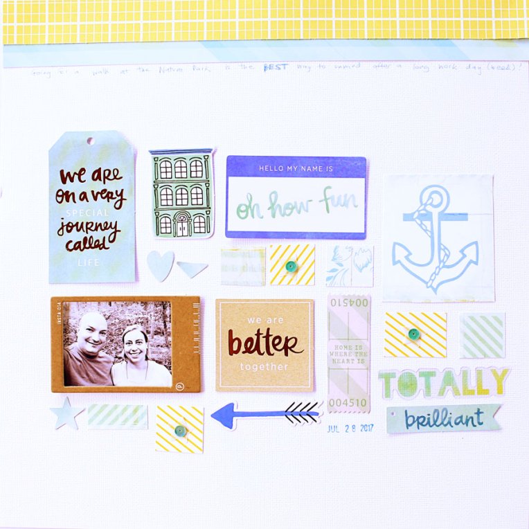
Slider Card Tutorial for Sweet Stamp Shop

I was a guest designer for the October release at Sweet Stamp Shop, and I have a tutorial to share to make this fun slider card using the Flying Squirrel stamp set.

I started by stamping the images from the set using black dye ink (Memento Tuxedo Black), coloring them with my Copic Ciao markers (YR0000, YR15, YR68, Y15, R22, E11, E31, E35), and fussy cutting them.

Next, I started building my slider card. I have a video to show you how to plan out the card and cut the slot for the slider element.

Next, I made a blended background for my card. Here’s a video showing how I used Distress Oxide ink pads (salty ocean, wild honey, carved pumpkin) with an ink blending tool to make the background.

Finally, I and added the sentiment stamping to the front and inside of the card (not pictured: the stamping of the “Happy Fall” sentiment on the inside of the card) and assembled it, as you can see in this video.

The final result is so much fun! I love how versatile this stamp set is – it’s perfect not just for Fall, but for birthdays and everyday cards too!


And I have some good news for you: Sweet Stamp Shop is having an early Black Friday sale, so you can pick up this stamp for 30% off!
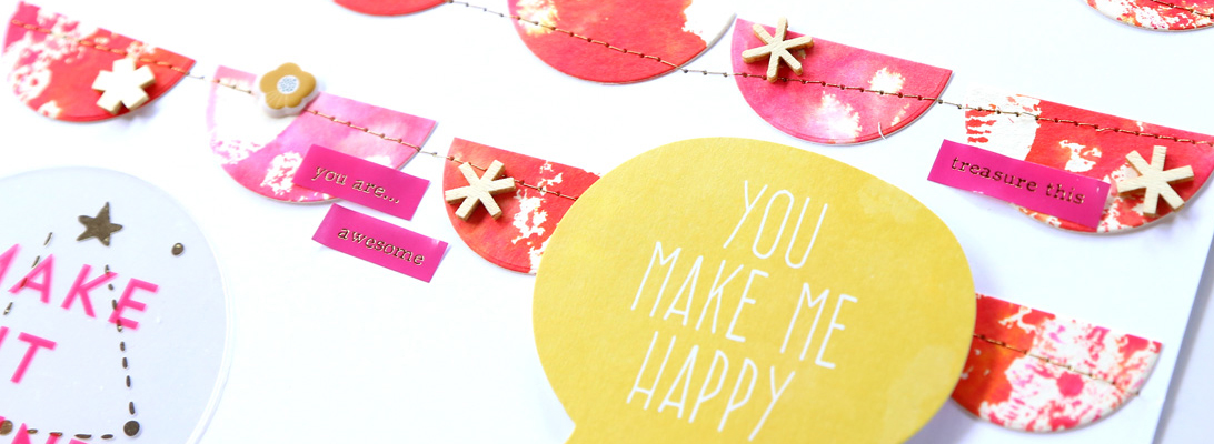
Fun Neon Spray from Acrylic Ink

I recently bought 3 bottles of acrylic ink by Daler-Rowney. (here’s a set of neon colors, and I also bought the gold).

As you can see the colors are incredibly vibrant and fun! The bottle they come in has a dropper and I was planning to use that for making drops on my projects, but then I had an even better idea – to use a mini mister bottle and make my own spray!

The acrylic ink is very fluid so I used it straight from the bottle, without diluting it. It worked like a charm!


Here’s an example used in my traveler’s notebook (Hobonichi weeks):

(it’s really hard to photograph these vibrant colors, but they are so vivid in real life!!)

I’m so happy to have found these inks – especially since my go-to gold spray (Heidi Swapp’s color shine) has been discontinued!

Weekend Pages

Hello! I had a rather productive weekend and, among other things, completed three 12″x12″ paper layouts. All of them use some old Studio Calico kits that I bought on sale. The first two are made with the Front Row scrapbook kit.

The hearts and black arrows are two sides of the same sheet of patterned paper – I had used a piece of it on this page a couple years ago, and now I used up what I had left.

I also used some die cuts from my stash.

The next page also uses the Front Row scrapbook kit, as well as a bunch of die cuts.

It was so fun to build this collage!

The green/blue/yellow color scheme is so refreshing.

For the last page, I had fun playing with my Distress Oxide inks! For this page, I dug out the Pool Party scrapbook kit from July 2016.

After the mega date stamp… there was the mega wine glass! 😀 Here’s a look at how this page came together.

The colors were inspired by the strips of patterned paper, so I chose some Distress Oxide ink colors to match, and stamped the title with them.

Next, I swiped the ink directly from the ink pad on a piece of clear plastic packaging, misted it with water, and transferred the color onto the alpha cards.

I love this easy and fun way to create a watercolor look with distress inks!

I hope you had a great weekend!

{this post contains affiliate links – if you make a purchase, you’ll support me at no additional cost to you}

Anniversary Week – Day 4

{this is part of a series I wrote for write.click.scrapbook. You can find the full post here}

Welcome to Day 4 of this Anniversary Week! Today I want to share some mini albums I made to celebrate some anniversaries.

The good news is that if you are successful in getting photos for the pages we talked about on Day 1 and Day 2, you will have all the materials you need to put together a mini album as well.

First, I want to share the mini album I put together to celebrate our first ten years together. In the background you can also see the matching card I made.

Each of the inner pages features a photo of the two of us.

More recently, I made a mini album based off of some journaling cards by Sahlin Studio.

On each numbered page I hand wrote the highlights of that particular year.

I hope you enjoyed the mini album inspiration. Come back tomorrow for some anniversary gift ideas!

Anniversary Week – Day 2

{this is part of a series I wrote for write.click.scrapbook. You can find the full post here}

Today I am sharing some inspiration to document the big milestones. The tips from yesterday (let the photographs speak, feature the numbers, and tell the story)  apply to these pages as well.

One Photo Per Year

My first tip is to include a photo for each of the years. In this page I made to celebrate ten years with my husband I included a photo from each year we were together, and numbered them.

I wanted to use pictures taken roughly one year apart, but I didn’t have them, so you will note pictures taken both in winter and summertime. It was very hard to find a photo of the two of us together during those first few years – that was long before my scrapbooking days begun! Now, I make sure to take a picture of us at least once per month.

A grid design is also a great idea for this type of pages. Here’s one I made that also features the numbers prominently.

Then and Now

Another idea is to feature a picture from your first year together, and the most recent photo.

Come back tomorrow for some anniversary card inspiration!

DIY Double-Sided Leather Traveler’s Notebook Cover

Today I want to share a little DIY project I made last month – a double-sided leather traveler’s notebook.

I am not going to post a step-by-step tutorial because in fact I followed the instructions by the excellent Christine, with just a small change –  rather than a regular size traveler’s notebook, I decided to make a passport-sized one. This is my first traveler notebook and I made it with the purpose of carrying it in my bag when I go to work meetings, and I wanted something more compact. The bonus is that from 2 sheets of letter-sized leather I was able to make 2 notebooks, one for me and one for my mom. 🙂

Now… I’m not gonna lie – it took forever to put together (mainly because I didn’t have the right tools to thread the elastic!), but it was worth it – I love how it turned out!

The notebook is double sided, and even though when I bought the leather (these are pretty much the entire color option at Michaels) I thought I’d be using the aqua for the outside, I ended up falling in love with the texture of the brown leather and chose that instead. 🙂
I have two notebooks in my journal.

The notebook on the left was made by me, while the one on the right is a Midori passport – I bought it after the fact, and it turns out that the notebook I made is spot on!
I used yellow copy paper for the notebook made by me and I love the pop of color!


I chose not to bind the notebook and it’s really quite freeing to know I can just get rid of a page if I mess up.

Here’s a closeup of the stitching, which I did with my sewing machine but turning the wheel by hand (I didn’t trust my sewing skills for this project!):

The stitching holds the two pieces of leather together pretty well (in fact the only change I would make in Christine’s instructions is to skip the fabric interfacing step – I found it didn’t really stick properly in my case).
The pretty charm was given to me by my mom a few years ago and is by Thun.

This passport size has been working really well for me, and it made me take the plunge and purchase a full sized traveler’s notebook as well – I would love to try my hand at scrapbooking in that size, so stay tuned… 😉

Hybrid Page

I am reposting a quick hybrid tutorial I made for the write.click.scrapbook blog.

I ventured into scrapbooking from the digital side and, while I still do all-digital pages, now I also love incorporating digital designs in my paper pages. Digital designs are so easy to use. They can be as simple as adding an overlay on top of your photos, or they can be used to jumpstart the page’s design, like in the example I will show today. What I really like about it is that I can plan my page on the computer before committing to paper.

The start: on the computer
For this page, I used a set of digital brushes by Ali Edwards called Who What Where Why Boxes. I was inspired by this set of brushes to make a page about me, so I selected four boxes that would help me tell the story. I laid them out on my canvas in Photoshop, and picked four photos to go along with them. I also changed the color of the boxes. I laid everything out in a nice grid design.

This could very well be a digital page as is, and could be completed by adding some simple journaling. Instead, I decided to turn it into a hybrid page — this means that I printed out the digital elements and my photos, and combined them with some papers and embellishments from my stash.

Print
I print everything at home – it’s so much easier for me to be able to go from computer to paper in one click and a few seconds. I recently got a new printer and I like the quality of the prints. For this page, I wanted to add some texture, so I decided to print the digital brushes on vellum paper. I printed the photos on photo paper.

Match with other supplies
Next, I picked a neutral background paper from my stash (by Basic Grey). I also used some letter stickers (Simple Stories) to add a few words under each box. I used colored brads to attach the vellum boxes to my page.

I stitched down the letter stickers with my sewing machine. At first, when I laid out my page on the computer, I was planning to make an 8.5″x11″ page. But then, after placing the photos and boxes on the background, I liked the white space on the side, and decided to keep it and add a stamped title.

And there you have it!

I love the texture that these boxes add to my page with the see-through effect.

And now.. I’d love to hear from you! Do you incorporate digital designs in your pages? Leave me a comment and let me know!

Letterpress and Scrapbooking

Hello! I am sharing here the post I made yesterday for the write.click.scrapbook blog on letterpress. I just started letter pressing last week, and I am in love! A while back I showed you how to create a faux letterpress look using embossing folders, but today I want to show you how to do real letter pressing.
Here is what you will need:

  • Die cutting machine. I have a Big Shot.
  • Letterpress platform. I have seen people who say they can letterpress just by adding some cardstock shims and the regular cutting pads, but I didn’t want to have to guess every time so I bought the platform – and I have no regrets! Especially since letterpress paper is pretty expensive and I don’t want to waste it on trials.
  • Letterpress paperThe type of paper you use is critical to get a deep impression and get the most out of your letterpressing. I know some crafters have great results with watercolor paper, but that has not been the case with the watercolor paper I had on hand, so letterpress paper it is for me.
  • Letterpress platesThere are many designs available, I’m sure you’ll have fun picking your favorites!
  • Ink. To be honest, I have not tried letterpress ink just yet. I’ve heard horror stories about how hard it is to clean up, so I started going the easy way, and I have just used ink pads for now. 🙂 The examples on this page use distress ink pads (I love the bright colors). I also love doing blind impressions (no ink) as I think adding the ink detracts a bit from the deep impression. More recently, I tried pigment inks and also letterpress inks – the cleanup isn’t really that bad as long as you use the convenient wipes that come in the letterpress kit, and the coverage is the best!
With the idea of putting a page together, I made two letterpressed cards using plates from Studio Calico.
For the card on the left I used the picked raspberry color, and I added spiced marmalade for the card on the right to get an ombre effect.
I used the Poet Society kits by Studio Calico for my page. Using the letterpressed cards, it was very easy to build a design using my photo and some strips of patterned paper. I added some stamping with grey ink to tie to the background paper, and completed the page with some gold splatters and sewing.
Here are a couple detail shots.
I hope this has inspired you to give lettepress a try – I love how easy it is to put together a page starting from a couple of letterpressed cards. Share your creations in the comments! I’d love to hear your tips too, as I am just starting out myself.

Anniversary Week – Day 5

{this is part of a series I wrote for write.click.scrapbook. You can find the full post here}

Welcome to the last day of this Anniversary Week! Today I am sharing some ideas for anniversary gifts.

Some of these projects don’t require photos, and others do, so you can pick the project based off of what you have available.

Let’s start with a photo-less project. Here is a set of personalized coasters I made. I bought the tiles at Lowe’s and covered them up with different digital papers.

Last year my in-laws’ celebrated their 50th anniversary, so I collected a bunch of photos from their family and friends and made a photo collage. We had it printed and framed for them. They loved it!

Next, I want to share two frames I decorated. These make a great gift too. I got the frame from Michaels and it’s very easy to cover up and embellish.

This other frame was from the dollar store, and I covered it up with paper.

Finally, I wanted to share the wall heart-shaped photo display I put together. I prepared photo and paper squares of ~3 inches side and arranged them in a heart shape. I just love how this looks in our living room!

I hope you enjoyed all the anniversary inspiration this week!

Anniversary Week – Day 3

{this is part of a series I wrote for write.click.scrapbook. You can find the full post here}

Welcome to Day 3 of this Anniversary Week! Today I will be sharing some inspiration for anniversary cards.

I find it especially meaningful to give a homemade card to celebrate the sweet milestone of an anniversary.

Some of the tips I shared on Day 1 still apply to cards. In particular, focusing on the numbers is always a nice way to build a card.

Here’s an example from me for our 6th anniversary.

For my in-laws’ 50th, I made a card that featured gold – the color of the 50th anniversary.

Finally, this is the card I made this year for my husband.

Come back tomorrow for some mini album inspiration!