He Said She Said

I was making a card today and, because for some reason I cannot seem to be able to print on only half a sheet of paper, I made another page for my art journal too to print along with the card. πŸ˜‰ Am I the only one who tries to cover the most surface possible when printing one sheet of paper? πŸ™‚

Credits:
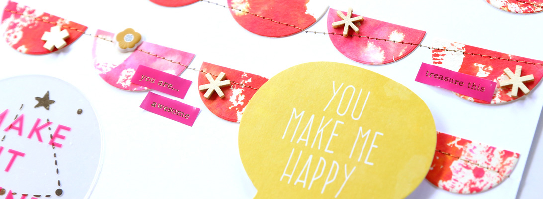
Paper from Orchid Elixir, Painted Grunge Papers, Chipper Chatter: Verbs, Vintage Paper Lace by Studio Tangie
Fonts: Dead secretary, SociaL AnimaL, Badaboom BB

Supplies:
Red River Paper polar matte
Glossy accents
Glue dots

And in case this page made you wonder – yes, I did have a good weekend – eventually. πŸ™‚
The worst part of my weekend was having to wake up early this morning (a holiday!) to drive DH to the train station. Oh well. I stopped at AC Moore’s on my way back home to buy some flowers and brads. πŸ˜‰

As of now, my blog has widened to fit images 600 pixels wide. It was about time! πŸ™‚

Something New

I was RAKed by Sylvie of Sausan Designs with a very lovely kit of hers, Hip!, so I finally took the plunge after drooling for months over the many creative art journal pages in the galleries all over digiland, and started my very own art journal. Of course it’s my interpretation, so it’s not over packed with stuff, but I really, really love these pages!

Credits:
Hip! by Sausan Designs
Fonts: Eutemia I, Pea Summer Funkyness, Rebekah’s Birthday, the King & Queen font, Pea Stacy’s Doodle script and Le bain au milieu de la fin d’aprΓ¨s-midi vers 17:49

Physical supplies:
Printed on Polar Matte by Red River Paper
Glossy accents used on the flower
Ranger Tim Holtz distress ink

Yes, I did my first hand stitching on a project ever, and I love how it turned out! (it took me forever though πŸ˜‰ ) You can’t really tell from the picture but there’s glossy accents on the flower. There’s also a half-face of mine blended in the bottom right hand corner, not sure if you can see it. πŸ™‚
I used a notebook with pages of about 4″ – fairly small so you can’t fill the page with tiny details, but it’s so cute!
And here’s the second page:

Credits:
Hip! and newsletter freebie by Sausan Designs
Font: Pea Olson

Physical supplies:
Printed on Polar Matte by Red River Paper
Ranger Tim Holtz distress ink

The orange color on this page is not digi – it’s distress ink mixed with water. So cool!

I’m so excited about this new project! πŸ™‚

A Few Challenges

I am (slowly) scrapping my mom’s visit. Here’s another part of her first day:

Credits:
Template by wm[squared] designs Shopaholic mini and add-on by Plum Dumpling Designs
Kraft paper from Background Essentials by Jennifer Barrette
Stitches from Stitch Me Up: Combo by Chelle’s Creations
Photo actions by Pioneer Woman and Totally Rad
Font: CK mini

I did this for the Tuesday Template challenge at ScrapMatters. I rarely use templates, but I really liked using this one!

I also made a card for today’s It’s in the Cards challenge and I really LOVE how my card turned out!

Credits:
Digi:
Template by Julie (Juliemomof4)
Kiss That Frog by Britt-ish Designs and DeCrow Designs
Font: CK mini
Physical:
Red River Paper polar matte
Ranger Tim Holtz Distress ink Peeled Paint
Ranger Cotton Candy Stickles
Glue dots
BBP strass adhesifs

And here’s a detail of the froggie and all the stickles:

I also entered this for a contest going on at Tim Holtz‘s blog. That man is such an inspiration! I’ve been expanding my techniques (and supplies too, LOL!) ever since I found his blog back in December.

Animal Mobile

Happy Saturday! I’m here to share my project for the May ScrapMatters newsletter. This was so much fun to make! However, taking a picture of the completed project was not fun at all: I didn’t have enough light, and all the animals kept moving around! Ugh! Here’s the best shot I could get:

Credits:
Giraffe and bird from Animal Kingdom by Britt-ish Designs
Frog from Kiss That Frog by Britt-ish Designs and DeCrow Designs
Turtle and seagull from Fish Are Friends by Britt-ish Designs
Bunny: shape from Sunshine and Daffodils (elements) by Sahlin Studio, paper from Animal Kingdom by Britt-ish Designs and pompom from Easter Salutations by Britt-ish Designs and Studio Tangie
Fish from More Fish Friends by Britt-ish Designs
Elephant from Land of Fantasy by Britt-ish Designs and Sahlin Studio

I used several kits by Britt-ish Designs to find the adorable animals for my project.

It looks so much better in person. When I finished it, DH said it turned out much better than he expected (ha, thanks for the vote of confidence!). I’ll take that as a compliment, anyway. πŸ™‚

Happy Mother’s Day!

Happy Mother’s Day!
I am very happy that my mom is actually visiting right now and spending Mother’s Day together is just an added bonus!

Here’s my Mother’s Day Card (featured in the April ScrapMatters newsletter):

Credits:
Happy Go Lucky by Jennifer Barrette

If you aren’t signed up for the newsletter yet, you can do it here!

Hybrid Cuteness

One of the April guests at ScrapMatters, Armina Designs, has this adorable pack in the store:

As soon as I saw it, it screamed “hybrid” to me! πŸ˜‰
So I managed to squeeze in a couple of projects yesterday – I’m so glad I did, because they turned out super cute.
First, a set of bookmarks – I plan to give these to my parents. Lion for Mom and the zebra for Dad (his favorite team’s symbol is the zebra).

Credits:
Papers from Animal Kingdom by Britt-ish Designs
Cute Clips 5 by Armina Designs

They’re double sided. Yep, I laminated them – my experience so far with bookmarks tells me that this is the best way to go. Mod Podge also works, but it stays sticky for a few weeks – not good for books that have shiny pages.
Then I also made a card (which was the first idea I had when I saw the product in the store):

Credits:
Cute Clips 5 by Armina Designs
Stamp my ABCs by Britt-ish Designs
Font: Pea Olson

Most of my projects look better in real life than in picture, but this one especially! πŸ™ I used crackle accents for the animals and mounted them on foam dots – they look really so cool, but you miss the dimension in the picture. Ah well…
I also completed the hybrid project for the May newsletter and I can’t wait to show that off – won’t be for a couple of weeks at least though. I haven’t taken pictures yet and I’m dreading it because I know it’ll be a pain to photograph. When DH saw it finished, he said he didn’t expect it to be so cute: and this is the highest compliment, for me! πŸ˜‰ Sign up for the ScrapMatters newsletter if you haven’t already. πŸ™‚

Spring Basket and some LOs

I know (and I hate it): I haven’t blogged in quite some time! I do have a few things to show, though. Most are pretty old, too! This project was featured in the March newsletter at ScrapMatters and I’d better post it before spring is over! πŸ˜‰

Credits:
What a Wonderful World by Connie Prince

Putting this together was quite a pain, but isn’t it adorable? πŸ˜‰
Then I have some random LOs to share. First off, these two (I’m slowly building my DC album) that I really love:

Credits:
Everyday by Sahlin Studio Wet Paint Alpha by Chelle’s Creations
Alphas: Metal Collection by Gwenipooh Designs
Font: JH Kari font – Designs by Jeni Hopewell
Photo action by My Four Hens Photography

Credits:
Around the World by Britt-ish Designs and Sahlin Studio Painted Alpha by Sahlin Studio
Font: JH Kari font – Designs by Jeni Hopewell

And then there’s this one (finished scrapping Easter pics from last year):

Credits:
Photo action by My Four Hens Photography Font: Pea Olson

I hope to blog again soon with a few other things to share. πŸ˜‰

Card Set

There’s a fantastic collab in the store at ScrapMatters

and if you buy it now you will get this amazing set of printable cards and envelopes for free (only until April 22)!

I made one of the cards+envelope that make up the set, here it is:

Credits:
Because I’m a Woman ScrapMatters April ’10 collab
Cover it up: invitation by Krisi’s Kreations

This kit is absolutely gorgeous!

Happy Birthday Mom!

Today is my mom’s birthday and I sent her this card:

Credits:
Let Them Eat Cake by [wm] squared designs
Suitcase and ticket from Around the World by Britt-ish Designs and Sahlin Studio

It’s not my usual card and I had so much fun putting it together! πŸ˜‰
I started off printing out the embellishments on presentation paper (I had some room left over as I was working on another project): at this point, I had’t thought about what card I wanted to do so they just sat on my desk for a while. A few days later, when it was time to mail the card, I decided to design a card to print on a 5×7 glossy paper and add the embellishments on top of that, so I designed a funky card with my mom’s picture and drawings made with my tablet. Since I’m pretty sure my mom doesn’t want me to remind her she’s turning 62, I also added a suitcase+ticket for her upcoming trip to visit me, because I knew she’d appreciate the detail.
Of course, since things never go as planned, for some reason my printer didn’t do borderless so the card turned out smaller than it should have – thus the too big party hat and the white border of the card showing. πŸ˜‰ But I think it’s still OK, if you don’t know it (I hope).
I inked the edges of the elements with Tim Holtz’s orange marmelade distress ink (I also wanted to buy the broken china, but can you believe my AC Moore only carried the orange marmelade?!? I hope it’s a temporary thing and they’re just reorganizing things..). I attached them with foam dots. I was afraid they would get squished in the mail, but even though I haven’t asked my mom explicitly, she was enthusiastic about the card, so I suppose it arrived there in good shape.

I had a left over candle that didn’t fit on the front, so I put it on the inside of the card.

I am really happy about trying out something different with this card! I asked DH if he liked the card, and he said he did. I then asked him (yeah.. usual mistake) if it looked different from the cards I usually make and he said he didn’t see any difference.. :-/
I have been admiring all the art journal layouts in the galleries and I hope to have time to expore this technique more. While this card isn’t an art journal, it certainly was inspired by it!