Ready for NSD?

Eeeek. It’s May. And National Scrapbooking day is tomorrow!! Do you have crafty plans? I have school meetings in the morning, but after that I plan to get crafty. Yay!

In the meantime, here’s a couple of pages from me. The first is for the write.click.scrapbook May gallery. The theme was “everyday”.

Credits:
Scrap Your Stash Sketch 5, Good Eats word art and Happy Place word art by Digital Design Essentials
Photobooth by Paislee Press
Fonts: American Typewriter, Castro Script, Silverfake

It was my first page with the oh-so-trendy pie chart, and I like how it turned out.

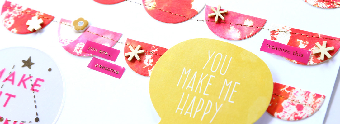
Next up, I had fun with creashens’ new kit! Oh, that pink+yellow combo has me smitten!

Credits:
Keen by creashens
Wet Paint Alpha by CD Muckosky
The Damsel Series fonts by Heather Joyce and Valorie Wibbens

Happy NSD! Make sure to stop by at The Lilypad for all the fun games, and to kiss a certain frog… 😉

At Sea Cards

I’m late in posting this, but Sahlin Studio and Britt-ish Designs’ latest installment of the Project Mouse series is so much fun!

Perfect for cruises, sea/lake, and so much more! I made two hybrid cards with it.

Here they are one by one.

I was inspired to make a round card and used my newly acquired Big Shot to cut the circle.

I hope you had a great weekend! Alas, I have not had any crafty time this weekend.. too much work/study to do. Next weekend is National Scrapbooking Day so I am really hoping to get some scrapbooking time.. but it’s not looking good! Do you have plans for NSD?

Hoppy Easter!

OK.. Easter is tomorrow, but I just have to share this adorable new kit by Jenn Barrette (20% off today) and the card I made with it!
These colors are just so pretty, and they look so vibrant when printed out on matte paper! I made a trifold card.

Happy Easter!

Hello Friday!

I am thrilled that it’s Friday! After a crazy weather swing from the 80s to the 30s, we are back in the 50s and I am enjoying it. I have lots of pages to share today! (Ok.. just 3 but it’s more than I usually have ;))

First off, I played with some of the new releases at The Lilypad (20% off all weekend long), and let me tell you.. I really had fun! Here’s what I used:

The first page is somewhat Easter themed – we made these cookies a few weeks back, but they are bunny shaped. 🙂

Credits:
Sunny Days Ahead kit by Paislee Press
100 Labels by Valorie Wibbens
Paper Mats Egg Hunt by Kaye Winiecki
The Golden Friends fonts by Heather Joyce

The second page I made with this kit describes the crazy weather we’ve had this week.

Credits:
Tag You’re It by Valorie Wibbens
The Golden Friends fonts by Heather Joyce

Switching gears, I also made a page with the new lovely kit by creashens. I love all the watercolor touches in this kit, and the colors are so pretty!

Credits:
Before kit by creashens
The Golden Friends fonts by Heather Joyce

It’s Easter Weekend so make sure to stop by tomorrow for a pretty Easter card I made!

Because I’m Happy

Today is the last day to take advantage of the early bird sale on Digital Design Essentials’ new collection!

All this for $5.99? Yes please!!
I am crushing on kelly green lately, and I sure got my fix here! 🙂 And of course, you never go wrong with hot pink. 😉

Credits:
Because I’m Happy by Digital Design Essentials
Font: The Velvet Vixen by Heather Joyce

Hybrid Tip!

I picked up a tip on instagram and I feel it will be a game changer for my Project Life. I tend to rarely include hybrid cards in my album because I don’t want to bother filling up a full 11×8.5 sheet of paper to print out.. So using a 6×4 sheet of paper is the perfect solution! Granted, it’s more expensive per journaling card than the larger paper, but totally worth it for me if it gets me to print more!
What brand of photo paper do I use? I go with Canon – I find it has excellent value. I use glossy 4×6 for photos, and matte 8.5×11 for hybrid projects. And now I will also use the matte 6×4 for Project Life cards.

Playing with Paper

After a couple of panicky work emergencies, I can finally take a breath and rejoice that the warmer weather has arrived! Granted, it is not yet here to stay for good, as we likely will be getting some snow later in the week, but I am choosing to ignore that for now. 🙂

I have been super busy with work, but today I carved out a couple hours for myself and got crafty. It was fun to play! I made a card using the lovely collection Sahlin Studio made for the April BYOC at The Lilypad.

I also grabbed the free April template on the Sahlin Studio blog and used it for my card. 🙂

Credits:

In my opinion, enamel dots are just the right touch for any project. 🙂 The same is true for mini alphas.

April BYOC

Well, hello and happy Friday! Today’s a good one, because it’s BYOC time at The Lilypad!!

I based my page on a navy/gray, yellow and orange color scheme. I love how it turned out!

Credits:
Freckles papers by Valorie Wibbens
Rainy or Sunny? papers by Little Butterfly Wings
Lemon Drop Elements by One Little Bird Designs
Pictures+Words no. 10 by Paislee Press
A Little Message by Kaye Winiecki
Painted Rounders by Amy Martin

Scrapping with the BYOC products is so much fun – it’s so easy to mix and match different pieces because they all go together!

April Already?

Hello and happy April! I am so happy to share the page I made for the April write.click.scrapbook gallery.

Credits:
Real Life collection bundle by Digital Design Essentials
Journal Junkie – Bright HeartGood HarvestDoodles-a-Fancy Borders and Blessed Beyond Belief by CD Muckosky
The Golden Friends fonts by Heather Joyce

I just love how it turned out! It also was scrap therapy for me, since I scrapped it at the low point of an awful week. I just love this hobby/creative outlet!

Retirement Sale… and a Walk Down Memory Lane

I love a good sale, and there’s a great one going on at The Lilypad right now. Sadly, several products are being retired to make space for new ones.. and the good news is that there’s plenty of deals to be made!

Here’s this page I made to scrap this week’s events:

Credits:
Lucky by Valorie Wibbens and Micheline Martin
Fonts: EM Deck the Halls by Emily Merritt, The Golden Friends fonts by Heather Joyce

Mini Album with the Citrus Twist March kit

I’m up on the write.click.scrapbook blog today with a mini album project. For the month of March, the team has received kits from different kit clubs and used them to make a mini album. My turn was with the March kit from Citrus Twist, and let me tell you – I had a blast!! I had never used a kit from Citrus Twist before, and when I opened my box I was amazed by the gorgeous combination of product. The colors were right up my alley, and made working on this project an absolute joy!

The wood veneer and stamp for the kit weren’t available yet when they shipped me the kit, so I got a previous add on stamp and some wood veneer arrows instead. The only thing I haven’t used in my album is the black washi tape. In addition to the album featured on the write.click.scrapbook blog, done exclusively with the Citrus Twist kit (plus doily + tags from my stash), I have added some stamping and a couple embellishments in the final version of my album, shown here.

The kit’s pretty colors and embellishments are especially suited for spring, but I had in mind to scrap a winter vacation we did back in 2005, and I thought the kit worked great for it too!

The album is 6″x6″, and I bound it using my Cinch binding machine. One of my favorite things was coloring the letters for the cover. Rather than using the mistable thickers with mists, I painted them with my watercolors.

As you may know, I love color, so I went with a gradation from pink to blue for my title. 🙂

Now, I will walk you through the pages of the album. There are fourteen double spreads, so sit back and relax. 😉

In most pages I used 4″x6″ photos. I did all the journaling using my typewriter. The stamping (mostly sold out stamps from Studio Calico) was done with Hero Arts shadow inks.
  
On this spread I used my mists in several way. To recolor the wood dots and wood veneer arrow, to add some droplets, and to mist the cardstock background on the right. I tucked a tag behind the photo with some hidden journaling.
I also cut out some of the hearts from this pretty Dear Lizzy paper to use as embellishments throughout the album.
Mostly, I let the photos take the stage. Bamberg is such a magical town!
This paper was so pretty that I ended up using it on both sides of this spread.
The fun ribbon included in the kit was perfect to add texture to this page! I also used a tag for some hidden journaling.
I love the bold statement of this paper by October Afternoon on the left paired with the Crate Paper one on the right- they matched my photo perfectly!
I love the pop of color on the paper I used to mat this photo. The little vellum stickers words from Studio Calico were perfect to add a little something to my pages.
It has been nine years since we took this trip, and we could only remember a couple of the things we did. So I looked for some facts on the internet about the buildings we visited. I am so happy to have this trip documented now!

I loved both sides of the Studio Calico Lemon Lush paper I used to mat my photo on the right, so I decided to fold the corners to show both sides. 🙂 I love the pop of color!

I made a photo collage on the left using templates by Designs by Lili to feature a collection of neat sightings from around town. On the right page, I cut a few strips from the Lemon Lush paper and sewed them down with gold thread.

I love the chipboard cameras in the Studio Calico Essentials line!

It was funny to see how few picture of us we took on this trip. Well, what can I say? Our picture taking habits have certainly improved since I became a scrapbooker. 🙂

And that’s it! Thirty seven pictures and one epic trip documented.


Thank you so much to Citrus Twist for this opportunity!