February

I’m really excited to share the page I made for the write.click.scrapbook February gallery. The theme is Technology, and while there are so many ways in which technology has impacted our lives, I chose to scrap about one that was especially significant last month for me. I love how this page turned out!

I bought multiple sheets of that background paper by Studio Calico and had been hoarding it, and it was just perfect for this page! I wish I had a whole world map actually, since not all the places I needed to pinpoint were on this map, but I made do.

Here are some details.


Have a great rest of the weekend!
Happy 2014!

Happy new year!! 2013 has been a good year for me. I made a year in review page for the January gallery at write.click.scrapbook and I love how it turned out!

I kept it simple and let the photos speak.

I did some embossing in silver metallic zing to create a visual triangle around my photos.

Grey, red, black, yellow, silver.

Happy new year!

Hello December!

I am excited to share my page for the December gallery at write.click.scrapbook! This month’s theme was holiday traditions, so of course I had to scrap our favorite one. 🙂

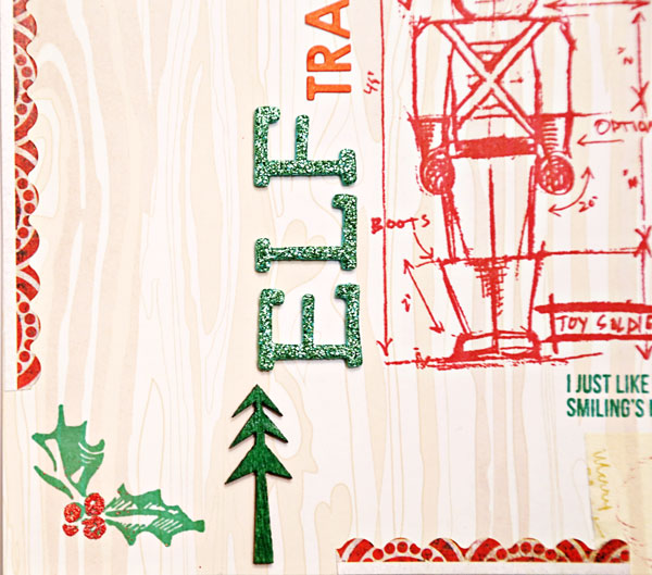
I had lots of fun stamping and embossing on this page! Here are a few details.

Red glitter Zing embossing powder is a must for Christmas pages! 🙂 I also bought the green one but haven’t used it yet.
These Christmas Blueprints stamps by Tim Holtz are from last year, but I just bought them and I am in love! The Santa is from this stamp set and it’s just too cute! I bought these stamps with December Daily and Christmas cards in mind. I am glad I got them!
Another purchase I made with Christmas in mind was Ranger Archival Ink in emerald green and vermillion. I love how smooth the stamped images turned out!
Hope you had a great start to the month!

Hello, November

The theme for the November gallery at write.click.scrapbook is Dreaming. I let myself embrace the Christmas spirit and made this page, Dreaming of a White Christmas.

But rather than just a white Christmas – even though I firmly believe that snow must be had at Christmas!! – I am dreaming of spending the holidays with my family. It’s not going to happen – yet again – this year, and it makes me sad..

Here are a few detail shots.

I added some watercolors behind the white alpha to make it stand out. 🙂
Amy wrote a great post that was inspired by this page. What are you dreaming of for Christmas?

Day in the Life

Hello October! A new gallery is up on the write.click.scrapbook blog, and this month’s theme is A Day in the Life. I feel I already do a decent job of documenting the small everyday things between my digi pages and Project Life, so I don’t typically do these “a day in the life” or “a week in the life” projects. however, last month I started a new class schedule, so I thought it would be fun to use this inspiration to document it. Here’s my page:

Credits:
4×6 Photo Templates v2 by Designs by Lili
Days of the Week: Saturday by Mari Koegelenberg and Sugarplum Paperie
The Damsel Series fonts by Heather Joyce and Valorie Wibbens

I think this is my first 8.5″x11″ digital page! Initially I was planning to do a hybrid page, but then I ended up loving the digital elements so much that I left it at that. 🙂

Calendar Week – Wrap Up

My Calendar Week blogging over at write.click.scrapbook is concluded. On Day 1, I talked about planning for a wall calendar; on Day 2 I showed you how I get my wall calendars done; Day 3 was all about desktop calendars; on Day 4 I talked about how to use calendars in mini albums and Project Life; and finally on Day 5 I shared some inspiration for how to use calendars in scrapbook pages.

Here are a couple of projects I made for Calendar Week. This page was inspired by a calendar grid design.


Credits:
Monthly Gridlock by Amy Martin
Dayplanner kit by Paislee Press and One Little Bird
The Roots fonts by Heather Joyce

And I put together a desk calendar using these awesome templates by Paislee Press:

These templates are so easy to use, and I love the design!

I selected a bunch of photos taken around our home for this calendar.


Credits:
2014 Calendar Kit by Paislee Press

I love how it turned out!

Calendar Week – Day 4

{this post was originally written for write.click.scrapbook}

So far, in this Calendar Week, we have been focusing on calendars in their most traditional use, and as standalone projects. Now, let’s look at how to incorporate calendars in mini albums and other projects to keep track of time.

The reason I include calendars in these projects is to add a time reference, but I always like to make the calendars part an integral of the design. I usually accomplish this by customizing colors and themes.

Mini Albums

For mini albums, especially ones that are dedicated to specific periods in time such as December Daily, I love to include a calendar. Here are two examples for my two past DD albums.

In 2011, I included a printed digital calendar element to the inside cover of my album. That year, my album had a red+aqua color scheme, so this calendar was a perfect match.

Last year, I layered the calendar on top of a digital paper, and used it on the first page of my album.

Pocket Page Scrapbooking

I am a huge fan of Becky Higgins’s Project Life concept to document our everyday life. I make weekly 2-page spreads, and each week I like to include a way to keep track of time. Calendars are a great way to accomplish this purpose, and also add visual interest.

For this card, I used Amy Tangerine’s customizable calendar stamp by American Crafts. Since this particular week was spanning two months, I thought this ampersand card would go be a good complement.

Here is another example of how I included the calendar stamp in another pocket. I added some arrows to highlight the particular week.

Finally, here’s a card created digitally, and printed out. I used the calendar cards by creashens. I love how the different elements on these cards come in separate files, because it allowed me to change the colors and rearrange the big numbers as needed to spell out the week number.

Do you include calendar elements in your mini albums? I’d love to see your examples, please share them in the comments!


Calendar Week – Day 3

{this post was originally written for write.click.scrapbook}

Welcome to Day 3 of Calendar Week! Today I will show you a couple of ways to put together a desktop calendar.

Desktop Calendars

Due to the smaller format, I find that desktop calendars are quicker to put together than wall calendars. I also love that it’s easy for me to put them together at home. I have designed a few over the years, and in most cases I used pictures from scenes around our home.

CD Case Calendar

Here are a couple of pages from a CD case I made a few years ago.

I decorated the background with digital scrapbooking papers by Jenn Barrette, and also printed out a few digital embellishments and adhered them with pop dots to add some dimension.

I repurposed an old CD case to use as the holder for the calendar. I printed these at home, on my old but trusted printer (a multi-function printer and scanner by HP), on matte paper (my favorite for hybrid projects).

4″x6″ calendar

I recently put together a 2014 desk calendar using templates by Paislee Press. This calendar was so quick to make! The templates are in .PSD files, so you need Photoshop or Photoshop Elements to use them. All I had to do was pick my photos, and print them out. The photo selection was by far the longest part of this process.

I shrunk the templates slightly in order to fit four pages on a letter-sized sheet. I love the clean design that showcases my photos.

I printed them at home on matte paper, and trimmed them.

For the theme of the calendar, I chose scenes from around our home. These pictures make me so happy – I love our home and it will be really nice to have this calendar on my desk at work. This is how I will be displaying my new desk calendar.

Once the month is passed, the calendar page can transition to my Project Life album.. which brings us to tomorrow’s theme – using calendars in mini album and pocket page scrapping!

Calendar Week – Day 2

{this post was originally written for write.click.scrapbook}

Welcome to Day 2 of Calendar Week! Today we will be talking about wall calendars.

Wall calendars

Around this time of the year, I always start working on the calendar I put together for our parents. It’s now become a tradition since I have been doing this for five years, and I want to share what my process is for that. I design an 11.5″x8.5″ calendar topper (12 monthly pages + the cover), and use a blank grid for the dates. Since I am also a digital scrapper, I find it quite easy to select a few of my favorite 12″x12″ pages and modify them to fit the smaller format. I always make sure that my design is at least half an inch within the edge of the page, so it won’t be cut during the printing phase.

Several printing services offer ready made backgrounds, so depending on what your design preference is, you will find plenty of options. I really enjoy picking a few favorite pages made in the past year and turning them into calendar toppers. If you want to design your own calendar toppers like me, or use a ready made quick page, make sure that the printing service allows for custom backgrounds. I have always had my calendars printed at Artscow, because they have great prices, and allow me to customize my calendars. Other services are known for top quality, so it all comes down to what you are looking for, and how much you are willing to pay for it.

To create a calendar of this size, you could also print the pages on letter sized paper, and bind it yourself. I don’t have the patience to do this, so I outsource.

The inside pages

Here’s a look at some pages from my past calendars. I always include a picture of my husband and me (I try to take them over the course of the year, but inevitably come September I need to schedule a few extra photo sessions to make up for the missing photos!). I decorate the page with colors and themes that match the month, and if at all possible I use a photo taken in that same month.

I prefer to keep the grid part clean and simple, so that everyone can use the calendar to jot down other appointments and events. I always include all the dates of family birthdays and anniversaries on the calendar (this is an option that Artscow offers).

The cover

I like to include some photos of us on the cover as well.

This project takes a few days for me. Selecting the photos and designing the calendar toppers takes a while, but the end result is worth the time for me! Tomorrow we’ll be looking at desktop calendars, and I would say that those are much quicker to put together.