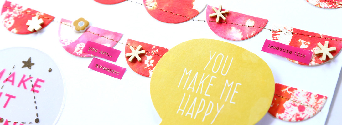
Hello and happy Friday! The new Memory Pockets Monthly collection is in the store at The Lilypad, and I love the warm fall colors!
The colors really pop against the dark background I chose for my page

Have a great end of the week!

Hello and happy Friday! The new Memory Pockets Monthly collection is in the store at The Lilypad, and I love the warm fall colors!
The colors really pop against the dark background I chose for my page

Have a great end of the week!

Wilna Furstenberg started a year-long workshop this month, and even though my attention span is typically very short, I decided to sign up for it. I love her style very much, I love watching her videos, and I liked the idea of this year-long creative journey.
I have made two pages so far inspired by Wilna’s pages and message. I tend not to journal much on my scrapbook pages (not sure why.. I journal tons on my Project Life, and quite a bit on my digital pages), but this page is mostly journaling, inspired by some recent successes (& added responsibilities) at work.

I used my Kuretake Gansai Tambi watercolors for the background and paint splatters (love them!!).

I gessoed + watercolored the background.
And then I made one of my favorite pages ever. I am not a scrap lifter, I always like to do my own thing, and even when I use sketches I often just use them as a starting point. So the fact that I have made this page very much based on Wilna’s example is really telling of how much she has inspired me. It was the sneak of this page that made me decide to sign up for the class!
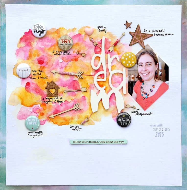
The background was done again with my Kuretake Gansai Tambi watercolors. I was going to go with a black and white photo, but then I found this picture of me that I had printed (and cut up and then not used) for another project, and I loved how nicely the colors matched my page. I journaled about the things I dream of. It turned out to be fantastic motivation for me! And the colors… oh how I love these colors!

I am so glad I embarked on this journey!

Well, it’s no secret I love color. And when I saw the latest collection by Digital Design Essentials I squealed… I absolutely love it!
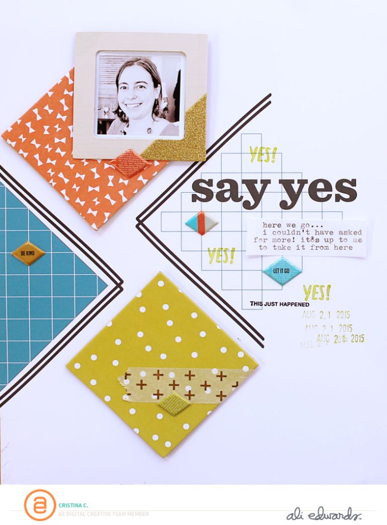
As is often the case with products by Digital Design Essentials, the design of my page was inspired by the kit, specifically that teal paper that has a tilted design.

I love how it turned out!
Also, I wanted to give you the heads up that Digital Design Essentials is having a 50% storewide sale, so it’s time to shop!!

I rarely make monochromatic pages (I love mixing colors too much I guess!), but it felt just right for this page.

For the pretty die cut title, I combined 3 of my favorite techniques: die cutting, embossing and watercoloring. I used digital brushes by Ali Edwards, cut them with my Silhouette out of Canson XL watercolor paper, and then I silver embossed it and watercolored it.

I am super sad that my term on the Ali Edwards Digital Creative Team is coming to an end. To say I have loved being part of the team doesn’t even come close to how awesome it’s been. I am so happy to have made weekly projects that I absolutely LOVE. Thanks you Ali and Katie for having me, and thanks to all my fellow team members for constantly amazing and inspiring me!

Since my September kit (Brimfield) is arriving soon to my door, it’s time to tally up what I made with the August kits. I bought a lot in August. In addition to the Studio Calico August scrapbooking kit, Pop Art ($34.99) I also purchased the Hockney embellishment kit for a promotional price of $17.99 and Stephanie’s mini book kit ($35.99 after rewards member discount – quite pricey but there were a couple of things in the kit that I really wanted).

Notes: I love the bright colors of this month. In the main scrapbook kit, I love the washi tape (love it!!), the specialty paper with the gold scratch off dots, and the acrylic circles. Not a fan of the stamp. The big alpha cards are really cool too. In the embellishment kit, I love the puffy plus signs, the enamel dots, the acrylic houses and the stamp. Not sure what to do with the “on point” card, but overall I love every single bit in this add on. In the mini book add on, I love the stamp, the frames, the floral paper, the gold dot paper and the enamel dots.
Status: killed
I made 16 layouts and 1 mini album with this kit (13 12″x12″, 3 8.5″x11″ and 0 9″x12″), for a total of $88.97, or $5.23/page (I counted the mini as 1 layout even though I have used up supplies for at least 2 pages in it). I supplemented the kit with some card stock and paper scraps from my stash, stamps, and the odd embellishment, as well as bits and pieces from the Pop Art card and Project Life kits.

Here are the bits and pieces I have left:

Leftovers: 2/3 of the specialty paper, the lavender card stock (I tried using it more than a couple of times, but it just didn’t work and I ended up leaving it — I will use it for some cards), the “on point” card (I am not familiar with this expression so I am setting it aside for now), some washi tape (love love love!! – not pictured because it’s on my desk), a few embellishments, an almost full sheet of alpha, some leftover letters, and some paper scraps.
I certainly could create at least another 2 pages with these bits, but I am ready to move on. I’ve been neglecting my Project Life lately!
Kill my Studio Calico kit is a monthly series I started on my blog to hold myself accountable and use up my kits. My goal is to use up a kit before the next one arrives.
And here is a walk through my pages
This is the first page I made this month:

The kits come with a handy 4″x6″ card that has the name of the month on the front and suggested color combinations on the back. When I pulled the card out of the bag and put it next to the papers, I loved the pop of color so I decided to use in on my page.
I also used a couple of cards and a rubber lemon from the Project Life kit.

The second page I made is probably my favorite this month. I love all the little details in the boxes, the split He|She design and the little tidbits about us.

While I was waiting for my kit to arrive, I looked online at the pictures of the content and was stumped by this paper with the big 8. But then I realized this year marks 8 years that we’ve lived in this town, and I wanted to make a page about that. I dug out those plastic letters from the Poet Society kit. I love them! I gave a slight pink tint to the white acrylic house with alcohol ink. I added the star stamps as an afterthought and I am still not sure if I like them or not (but there’s no going back..). And yay, I got LOTW (layout of the week) at Studio Calico for this page!

I wanted to use this bold paper as a background, and I felt that I could only make it work if I added something bolder – enter the gold paint and silkscreens! 🙂 The labels, glitter heart and wood veneers are from my stash.

This one is my 2nd favorite page of the month. I never use frames (not even in my digital pages!), but I played with these ones from the mini kit add on and I love how they turned out! I backed one with a PL card and the other with patterned paper.

Block design and gold – a great combination! I was seriously tempted to hoard that 8″x8″ gold foil polka dot on white paper, but I cut into it to make this page and I am glad I did!

For this page I cut up one of the papers that said “together is my favorite place to be” and used the letters to spell out “my favorites”.
I was a bit stumped by the square chipboard pieces from the embellishment kit (Hockney). But then when I paired them with digital designs from Ali Edwards’s Digital Story kit for August (Build), they were perfect!

I used just a small piece of that floral paper by Crate Paper (from Stephanie’s mini album kit), but I love it so! Also paired with a few digital brushes from the Build Story Kit by Ali Edwards that I printed directly onto the kraft background and my photo.

This was a fun page to make. And it also shows why I can stretch my kits so far, using only scraps of paper. 🙂 I just added some labels from my stash.

I love pink and yellow! I added a screenprint (“I love us”) and some hand stitching. Dressing up the kittens with bows was fun! The pink flower paper was from my stash. I used distress paint with the screen print (so easy to use!) and used it also to stamp the “let’s celebrate” and the cats.
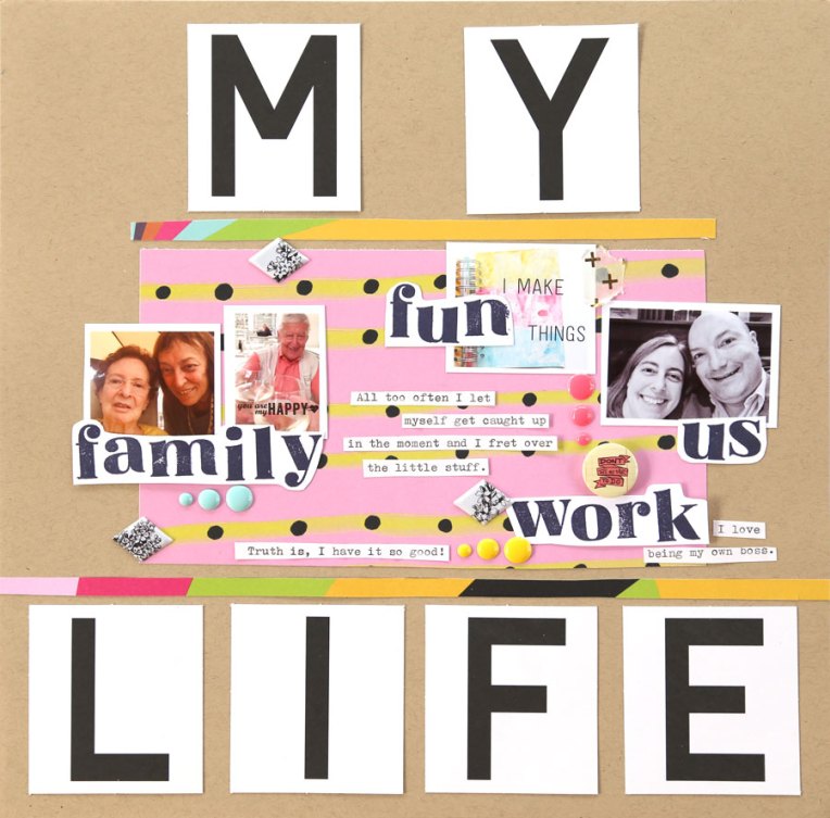
The alphabet in the Pop Art scrapbooking kit has only 1 character of A-Z plus numbers. So I had to get creative to stretch them further.

For this page, I wanted to list the happy moments from this summer. It’s been a rather stressful period work-wise, and I want to remember all the good things that have happened too.

After using up the acrylic numbers, I used the negative shape on this page. And I highlighted the number 16 using enamel dots. I splurged and bought 2 Hero Arts ombre ink pads lately and I love them! Here I used the mint to green one.

On this page I cut up three journaling cards and also used two 3″x3″ from the Pop Art Project Life kit. The background paper and alphas are from my stash.
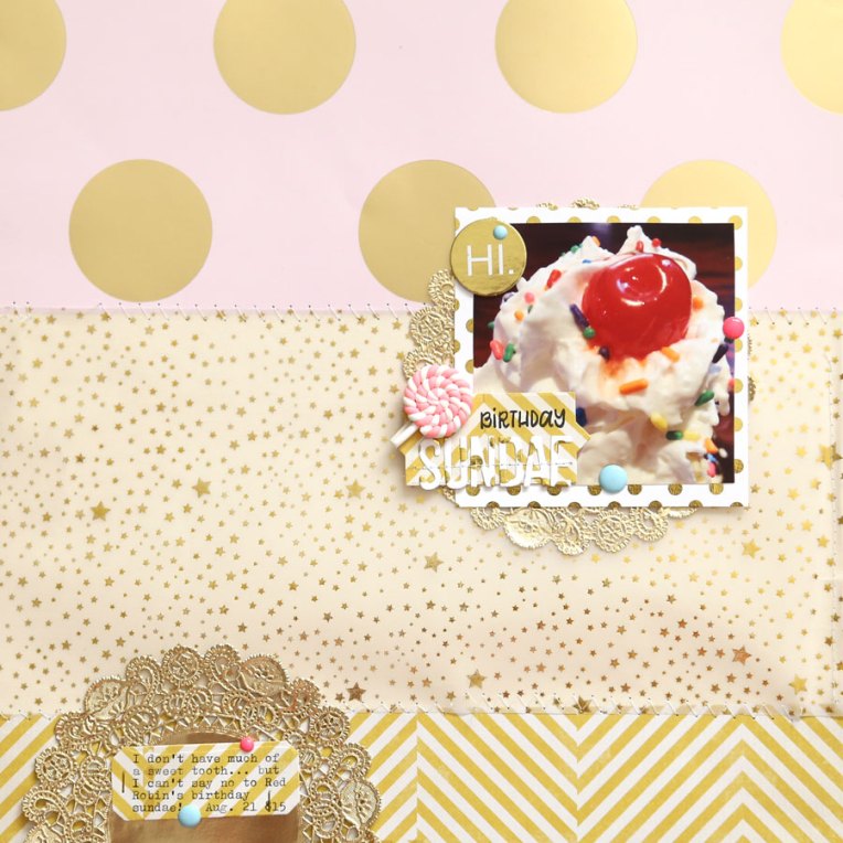
I finally got myself to cut into the specialty paper. The gold dots are actually scratch off, but I loved the finish so much that I left them unscratched. 🙂 The vellum and doilies are from my stash.
And that’s it! It certainly had been a productive month, that’s for sure! I felt the pressure to create a lot of layouts since I had bought so much, but in the end they all came naturally. I am happy to move on though!
If you enjoy this monthly series on my blog, please leave me a comment and say hi. 🙂
It’s been unseasonably hot around here lately, but everything else feels like fall. And the new Time for Fall brush set by Ali Edwards is perfect to document this time of the year!

I love the red/green combo I went with for my page. I added the “time for apples” brush on top of my photo and printed them out on my printer.
What does fall taste like in your part of the world?
This adorable kit by Mari Koegelenberg is 50% off right now!
It is too cute! Here’s what I made with it.

I just had to use each one of those adorable animals. 🙂
Today I dusted off my Silhouette cutting machine and used it with some new digital brushes from Ali Edwards.

This was a fun page to make!

I love how the white cut out words stand out against the bright floral patterns.

I hope you had a nice weekend!
Hello and happy Friday! It’s release day for the September MPM (Memory Pockets Monthly) at The Lilypad, and it makes me so happy! This month’s theme is composition, and the color palette is yummy.

Of course this kit and the add ons don’t have to be used in a pocket page.. in fact they work great for regular pages too!

I love how bright and fun this page is. Yellow + red + b/w.. love it!

I am in love with this floral pattern!
Also, I have another exciting sale to share – and you can thank me for this one! 🙂 These are my favorites from the entire store.
And check out the challenge in the forum using these products!