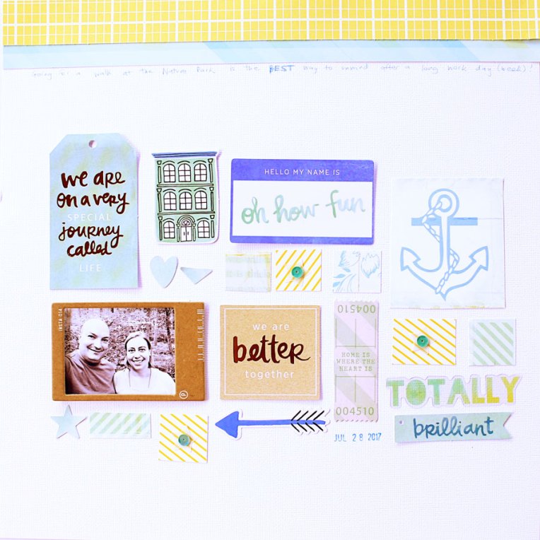
TN 2017 – Week 26

Hi there! I’ve been quiet lately, and the main reason (other than a crazy busy life) is that I’ve been catching up on my Project Life album. I have fallen horribly behind, but lately I’ve gotten back to it, finished up 2016, and started 2017. I also have an upcoming move coming up, so I will stay quite for a little while longer, but in the meantime here’s a spread I made in my traveler’s notebook from earlier this summer. 🙂

The stamps I used here are my favorite ones for traveler’s notebooks – from Sakuralala!

Memory Pockets Monthly: Narrative

Hi there! I have been quiet lately, for a number of reasons, including this one: we’re buying a new house! We found a place we absolutely love, but the whole process has been incredibly stressful and we’ll be so glad once the closing is done! I made a page to document the ordeal and timeline of this wait using the newest Memory Pockets Monthly collection from The Lilypad.

Credits:
For the August scrap lift challenge: lift of https://www.pinterest.com/pin/103301385185331032/
Memory Pockets Monthly: NARRATIVE from The Lilypad

I was inspired by the wood speech bubble outline so I build the design of my page repeating it on the page and adding different patterns and journaling cards.

Weekend Crafts

I was home alone this weekend, which resulted in watching at some craft videos and learning about new supplies I absolutely had to have… So here’s the result – I went shopping!

I certainly didn’t need any more brush pens or washi tape or stamps… but of course I had to have them. 🙂

I must have been living under a rock, because even though I had heard ravings about the mermaid markers before, I didn’t know who Jane Davenport was. But then I signed up for her free class using the products from her line for American Crafts, and I was hooked!

So I ended up buying the mermaid markers , the ink-edible pen, the paint over pens, a set of washi tapes (called “palette”), and a set of face stamps. I mean, I haven’t ever been interested before in faces in art journaling, but I’m telling you, I am totally hooked now! Here’s all my purchases documented in my Hobonichi cousin planner.

Sadly one of the paint over pens was totally dry when I opened the package, so I’ll have to return it. But the other pens in the set are very pretty and work great on top of watercolors (the only medium I’ve tested them over so far).

Isn’t that washi tape really pretty?? I love it!

And the mermaid markers are really great – you can squeeze on the barrel to make the ink flow, so you can easily get drops of color to used for your mixed media. And I love how affordable and convenient the Ink-redible pen is – you can use it with cartridges, or with a converter (to put in fountain pen ink, or even ink from the mermaid markers). I hope the refills will be made available.

Other than in my planner, I only used the markers on a card so far. Here it is:

I stamped a cupcake from the Birthday Blueprint stamp by Tim Holtz in Jet Black archival ink, then colored it in with the mermaid markers, and using a water brush for blending the colors together. I added some highlights with the white paint over pen.

The background was made blending distress oxide inkssalty ocean, peacock feathers, and twisted citron, then adding a few water droplets and silver mist to create a cool distressed effect activating the ink.

It’s so fun playing with new supplies! What did you play with recently? Let me know in the comments!

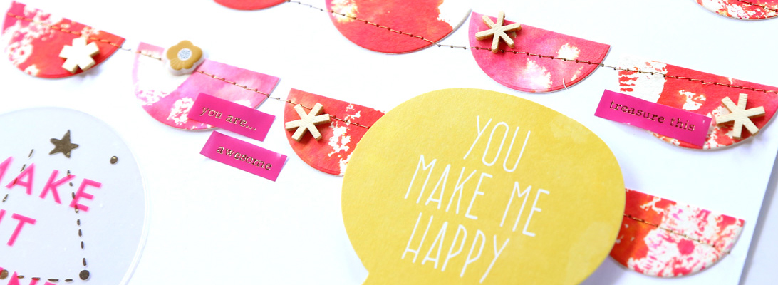
Ink Pad Organization

It’s no secret that my craft space is messy all the time, with little to no organization. But I was super inspired when I saw that my friend Celise had labeled all her ink pads (see Instagram photo here). Not only they looked very pretty, but it made it so easy to grab the right color! Fast forward a few weeks, and  I got the motivation to make labels for all my ink pads because I am hoping to get to redesign my craft space in the next month or so.

I finally broke down and bought sticker paper – I found these awesome 4″x6″ label sheets by Avery that fit in the 4″x6″ paper feeder of my Canon Pixma printer – I much prefer using these over regular letter-size paper because they are less wasteful since it takes much less to fill in the whole page. I designed my labels in Photoshop, picking the colors for each ink pad from online manufacture catalogs. And here’s the result of my Friday night labors:

Inks, left to right: Ranger Tim Holtz Distress Oxide Inks (dye/pigment hybrid) | Studio Calico Color Theory Dye Inks | Hero Arts Shadow Inks (dye) | Ranger Tim Holtz Distress Inks (dye)

I also lettered a new logo for this website – what do you think of it?

As you can see, I only labeled my dye inks, since most of the pigment inks I own come in 2″ cubes that fit perfectly in the Ranger Tim Holtz Mini Distress Ink storage tins.

Here’s a closer look:

I didn’t spend too much time measuring / planning this out, but the 4″ width of the paper was perfect to fit 2 labels for the distress inks (since they are square, I only need the label on one side), and 1 label that wraps around two sides of the rectangular pads.

I have a few stray ink pad here and there in my craft room, but rest assured that they will get labeled up soon too! I can’t believe I didn’t do this sooner, it makes it SO much easier to find the color I am looking for!

August BYOC at The Lilypad

A new month is here and this means it’s time for the newest BYOC collection at The Lilypad!

Credits:
August template by Valorie Wibbens although it ended up in a completely different direction!
Wildflower papersWildflower wordart & paint and Wildflower tags & stickers by Lynne-Marie

I took this photo a few months ago and held on to it because I loved it so much, but when I saw these products designed by Lynne-Marie I knew it was time to scrap it!

Goodbye July

I am saying goodbye to July with a few pages using the July BYOC (Build Your Own Collab) from The Lilypad – the August BYOC is released this Friday! I had so much fun using it to document the trip I made in June with my parents!

Credits:
A Bit Worn Topography No.3 by Valorie Wibbens
Hyannis by One Little Bird
Camp Rubbed On alpha and Camp Glitterbets alpha by Allison Pennington

I have lots of photos from this trip, so it was great to fit several with this template.

A Bit Worn Topography No.2 by Valorie Wibbens
Grillin’ & Chillin’ {papers} and Grillin’ & Chillin’ {elements} by Little Butterfly Wings
Claire & Her Closet (with BONUS Art Dolls and Claire Watercolor Elements by Rebecca McMeen

I’m so in love with this background paper, and the floral brushes!

A Bit Worn Topography No.1 by Valorie Wibbens
Summer Fun {Papers} and Summer Fun {Elements} by Paula Kesserling
Scenic Route Elements by paislee press

I love these patterned papers!

I also made a non-trip page. 🙂

Credits:
A Bit Worn Topography No.4 by Valorie Wibbens
Vibrant Flower Graffiti by Tangie Baxter
Grillin’ & Chillin’ {papers} and Grillin’ & Chillin’ {elements} by Little Butterfly Wings
Hyannis by One Little Bird
Scenic Route Elements by paislee press

I love mixing and matching different products from the BYOC because everything coordinates so well!

Credits:
A Bit Worn Topography No.2 by Valorie Wibbens
July BYOC 2017 – Build Your Own Alpha + Brushes by Just Jaimee
Hot hot hot papers and Hot hot hot elements by Lynn Grieveson

I also really enjoyed using some older templates by Valorie Wibbens for these pages – they make it so easy to build a page!

Weekend Pages

Hello! I had a rather productive weekend and, among other things, completed three 12″x12″ paper layouts. All of them use some old Studio Calico kits that I bought on sale. The first two are made with the Front Row scrapbook kit.

The hearts and black arrows are two sides of the same sheet of patterned paper – I had used a piece of it on this page a couple years ago, and now I used up what I had left.

I also used some die cuts from my stash.

The next page also uses the Front Row scrapbook kit, as well as a bunch of die cuts.

It was so fun to build this collage!

The green/blue/yellow color scheme is so refreshing.

For the last page, I had fun playing with my Distress Oxide inks! For this page, I dug out the Pool Party scrapbook kit from July 2016.

After the mega date stamp… there was the mega wine glass! 😀 Here’s a look at how this page came together.

The colors were inspired by the strips of patterned paper, so I chose some Distress Oxide ink colors to match, and stamped the title with them.

Next, I swiped the ink directly from the ink pad on a piece of clear plastic packaging, misted it with water, and transferred the color onto the alpha cards.

I love this easy and fun way to create a watercolor look with distress inks!

I hope you had a great weekend!

{this post contains affiliate links – if you make a purchase, you’ll support me at no additional cost to you}

Look Ahead – Memory Pockets Monthly: Observations

Hello and happy Friday! This week has been an emotional roller coaster, waiting for important news, and waiting, and waiting… hopefully things will settle down some today. So I was certainly in the mood for some scrap therapy with the latest Memory Pockets Monthly collection, released today at The Lilypad.

Credits:
In Review | August 17 Templates by Sabrina’s Creations
Memory Pockets Monthly: OBSERVATIONS from The Lilypad

I absolutely love these colors – gray, yellow and pink. And those floral patterns from some of the 3″x4″ cards included in the kit are so pretty!